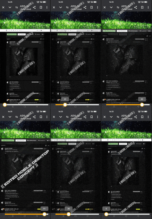
🤔...yeah butt, don't browsers already provide this exact option.
Adding an additional button to the design is basically just adding unnecessary clutter imo.
While I definitely find common ground with OP's opinion regarding the Mobile-Desktop preference.
😄 Honestly aye, standard mobile view looks budget af and generally just downright sucks overall.
Whereas on the other hand Mobile-Desktop looks gott dang magnificent!
Almost perfection...
...butt knot for appearing so squished-in.

•Is it possible to fatten up the MOBILE-DESKTOP VIEW ??
-(...without causing chaos elsewhere.)

/ EDIT 26 JULY 2024 /
-ADD: Link; EXAMPLE VERSION 2.0
((Original /vs/ Edited Mobile-Desktop))
https://asylum.flarum.cloud/d/3-image-dump/43
·
or instead: TL/DR;
·
((The low quality GIF overlay version))
