• Meta
  • Avatar badges UI suggestions

I've landed on a new arrangement for my forum and I'll share the code. It's a vertically stacked layout for the badges in most places. But, on mobile, badges are inline horizontally when viewing a post and replies. These adjustments look nice IMO, unhide the avatar, and separate the badges a little bit so that you can see the icon for each one.

As you'll see, this requires a lot of changes. Many more than the 2 small changes in the pull request that sparked this.

Screenshots first, then the code...

User profile

Discussion list (desktop)

A post (desktop)

Discussion list (mobile)

A post (mobile)

The code (paste into your custom CSS box within the admin)
/* Alt Discussion List Badges (Sticky & Lock) */

/* Stack badges vertically and overlap */
.DiscussionList .badges, .DiscussionList .badges>li {
    display: block;
    margin-bottom: -5px !important;
}

/* Reduce badge icon size by less than a pixel (original ~12px) */
.DiscussionList .Badge, .DiscussionList .Badge .Badge-icon {
    font-size: 11px;
    line-height: 18px;
}

/* Reduce color badge background width & height by 1px (original 22px) */
.DiscussionList .Badge {
    width: 21px;
    height: 21px;
}

/* Move badges off of avatar slightly (original -55px) - also push post title to the right 5px extra pixels */

@media (min-width: 768px) {
.DiscussionList .DiscussionListItem-badges {
    margin-left: -50px;
    margin-right: 5px;
}
}

/* Mobile rules for Alt Discussion List Badges (Sticky & Lock) */
/* Basically make things a little smaller */
@media (max-width: 767px) {
.DiscussionList .DiscussionListItem-badges {
    margin-left: -35px;
    margin-right: 5px;
}
.DiscussionList .Badge, .DiscussionList .Badge .DiscussionList .Badge-icon {
    font-size: 10px;
}
.DiscussionList .Badge {
    width: 19px;
    height: 19px;
}
}

/* Alt Post Stream Badges (Group Badges) */

/* Move badges off of avatar slightly (original -55px) - also push things to the right */
@media (min-width: 768px) {
.PostStream .PostUser-badges, .PostsUserPage .PostUser-badges {
    margin-left: -50px;
    margin-right: 10px;
    width: 47px;
}
}

/* Stack badges vertically and overlap */
.PostStream .badges, .PostStream .badges>li, .PostsUserPage .badges, .PostsUserPage .badges>li {
    display: block;
    margin-bottom: -8px;
}

/* Needed to put post back in original spot after adding margin-right of 10px to .PostUser-badges (original 105px) */
@media (min-width: 768px) {
.PostStream .Post, .PostsUserPage .Post {
    padding-left: 95px;
}
}

/* If you have 3+ badges this gives them more breathing room - moves post content over */
.PostStream .Post-body, .PostsUserPage .Post-body {
    margin-left: 8px;
}

/* Mobile for Alt Post Stream Badges (Group Badges) */
/* Put things "in-line" */
@media (max-width: 767px) {
.PostStream .PostUser-badges, .PostsUserPage .PostUser-badges {
    position: static;
    margin-left: 10px;
    margin-right: 10px;
}
.PostStream .PostUser-badges .Badge, .PostsUserPage .PostUser-badges .Badge {
    margin-left: -5px;
}
.PostStream .badges, .PostStream .badges>li, .PostsUserPage .badges, .PostsUserPage .badges>li {
    display: inline-block;
    margin-bottom: -8px;
}
}

/* Usercard fix */
.UserCard-profile .badges, .UserCard-profile .badges>li {
    display: inline-block;
}

/* Add thin border to badges */
.Badge {
border: 1px solid #ddd;
}

    luceos out of curiosity, how does this look with 5 or more badges?

    This is the whole problem of every badge css tricks I tried. Until now I just hide the user badges on my community (DiscussionPage) because we have some members with +/- 10 permission groups.

    badges cant be showed on hover in a grid? in this way we can handle multiple badges

      On my forum I'm running them both on top (on the left) and in the bottom.

      On top are mod/admin badges, and on bottom are personal badges.

      luceos On the discussion list avatars you’ll have at most 3. Sticky, lock, and following. It looks good with 3. Within posts with 5+ badges? It will start to look odd. But, as-is you have that problem. If you want badges on the avatar, once you get to 5+ badges it’ll look weird with badges on top, bottom, or vertical. You either have to tell yourself that you’ll never assign more than a few to each member. Which works for most communities. Or, hide all or some of them.

      Here’s an idea for the future: you always show lock, sticky, following, admin and moderator badges tied to the avatar. Because, that’s part of the Flarum look (although things change but I say this based on what others have said). Additional group badges can be in the on hover user card on desktop, and in a modal pop up on mobile.

      Another idea just came to mind. Obviously possibilities are endless. But, I try to think of simple/minimal solutions. If you want to unhide avatars while still going with the badge attached to the avatar look... you can do something like I proposed above (vertical stack), but only up to 2 or 3. To see ALL badges you simply have to go to the person’s profile. Without adding a lot of code, I believe this could be done with simple CSS. The CSS would say hide any children after the first 2 or something like that.

      How about this? But, this requires javascript loading at the right time. And, there would need to be different spacing depending on which page you're on. In other words, badges in a circle around the avatar are possible. But, not something I have time to tackle right now.

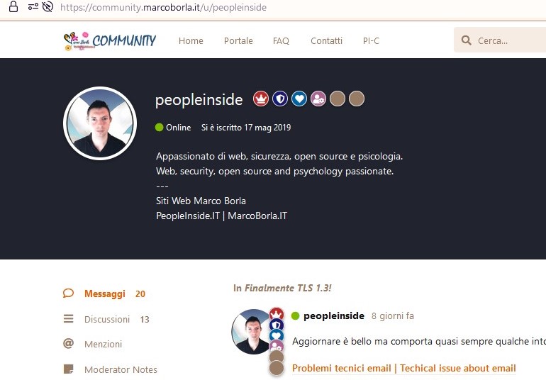
      During my lunch break today I tweaked the previously mentioned CSS. Instead of being fully vertically stacked, the badges slightly curve. This CSS also only allows up to 4 badges to be visible in the post stream. If you have more than 4, the first 4 will show in the post stream, and all others will be in your profile. The first screenshot below demonstrates this. You'll see 4 badges in the stream, but the user actually has 5 badges in their profile header.

      The idea is: show some badges next to posts, but if your community uses a TON of badges, then the extras will only be visible in profiles.

      Screenshots:


      /* Alt Discussion List Badges (Sticky & Lock) */
      
      /* Stack badges vertically and overlap */
      .DiscussionList .badges, .DiscussionList .badges>li {
          display: block;
          margin-bottom: -8px !important;
          margin-top: 2.7px;
      }
      
      .DiscussionList .badges>li:nth-child(2) {
          padding-left: 45px;
      }
      
      /* Reduce badge icon size by less than a pixel (original ~12px) */
      .DiscussionList .Badge, .DiscussionList .Badge .Badge-icon {
          font-size: 10px;
          line-height: 16px;
      }
      
      /* Reduce color badge background width & height by 1px (original 22px) */
      .DiscussionList .Badge {
          width: 18px;
          height: 18px;
      }
      
      /* Move badges off of avatar slightly (original -55px) - also push post title to the right 5px extra pixels */
      
      @media (min-width: 768px) {
      .DiscussionList .DiscussionListItem-badges {
          margin-left: -55px;
          margin-right: 15px;
      }
      }
      
      /* Mobile rules for Alt Discussion List Badges (Sticky & Lock) */
      /* Basically make things a little smaller */
      @media (max-width: 767px) {
      .DiscussionList .DiscussionListItem-badges {
          margin-left: -43px;
          margin-right: 15px;
      }
      .DiscussionList .badges>li:nth-child(2) {
          padding-left: 35px;
      }
      .DiscussionList .Badge, .DiscussionList .Badge .DiscussionList .Badge-icon {
          font-size: 8px;
          line-height: 14px;
      }
      .DiscussionList .Badge {
          width: 18px;
          height: 18px;
      }
      }
      
      /* Alt Post Stream Badges (Group Badges) */
      
      /* Move badges off of avatar slightly (original -55px) - also push things to the right */
      @media (min-width: 768px) {
      .PostStream .PostUser-badges, .PostsUserPage .PostUser-badges {
          margin-left: -50px;
          margin-right: 10px;
          width: 45px;
      }
      }
      
      /* Stack badges vertically and overlap */
      .PostStream .badges, .PostStream .badges>li, .PostsUserPage .badges, .PostsUserPage .badges>li {
          display: block;
          margin-bottom: -8px;
          margin-top: 0.1px;
      }
      
      .PostStream .badges>li:nth-child(n+5), .PostsUserPage .badges>li:nth-child(n+5) {
          display:none;
      }
      
      .PostStream .badges>li:nth-child(2), .PostsUserPage .badges>li:nth-child(2) {
          padding-left: 40px;
      }
      .PostStream .badges>li:nth-child(3), .PostsUserPage .badges>li:nth-child(3) {
          padding-left: 39px;
      }
      
      /* Needed to put post back in original spot after adding margin-right of 10px to .PostUser-badges (original 105px) */
      @media (min-width: 768px) {
      .PostStream .Post, .PostsUserPage .Post {
          padding-left: 95px;
      }
      }
      
      /* If you have 3+ badges this gives them more breathing room - moves post content over */
      .PostStream .Post-body, .PostsUserPage .Post-body {
          margin-left: 8px;
      }
      
      /* Mobile for Alt Post Stream Badges (Group Badges) */
      /* Put things "in-line" */
      @media (max-width: 767px) {
      .PostStream .PostUser-badges, .PostsUserPage .PostUser-badges {
          position: static;
          margin-left: 10px;
          margin-right: 10px;
      }
      .PostStream .PostUser-badges .Badge, .PostsUserPage .PostUser-badges .Badge {
          margin-left: -5px;
      }
      .PostStream .badges, .PostStream .badges>li, .PostsUserPage .badges, .PostsUserPage .badges>li {
          display: inline-block;
          margin-bottom: -8px;
          padding: 0px !important;
      }
      .PostUser {
      margin-right: 15px;
      }
      }
      
      /* Usercard fix */
      .UserCard-profile .badges, .UserCard-profile .badges>li {
          display: inline-block;
          padding: 0px !important;
      }
      
      /* Add thin border to badges */
      .Badge {
      border: 1px solid #ddd;
      }

        Justoverclock Yeah I struggle with how small is too small... Especially on mobile I think I could go smaller... But, would people have a hard time seeing the icon if I went any smaller? It's already down to 8px font size on mobile.

        010101 This is super cool and also works great with many badges, definitely something different!

        This is beautiful! One thing that might be worth considering though is some kind of indicator that there are more badges (a plus maybe?). And then if people hover, they'll see the user card.

          010101 sounds better for multiple badges, and it's pretty... fun I guess. I like it 🐈

          askvortsov One thing that might be worth considering though is some kind of indicator that there are more badges (a plus maybe?). And then if people hover, they'll see the user card.

          👍️+++

          Let's dream a little: if people hover the badges, the other badges circle entirely (with a little fade in) the avatar 😁

          askvortsov Yet another idea... I know we never want to add too much to core. But, since the existing badge layout has been the way it is for years and many people like it, we leave that as the default. Then in the appearance section there's a new switch: "Alternative badge layout." And/or, the alternative badge layout could be a fof extension.

          This way, you keep any old school loyal Flarum fans happy because the badges don't change. Unless... you flip a switch.

            010101 For me, the #1 priority is making sure that these changes are possible (and not too difficult) via extension.

            In core, we don't currently have "appearance switches" for anything else. I'm not sure we'd want to introduce that; instead, a micro-extension might be the way to go if possible.

              010101 I actually quite like the way those groups rotate around the avatar. It's different, but it's clean and not so horribly different that it makes me feel like it's "Not the Flarum way"