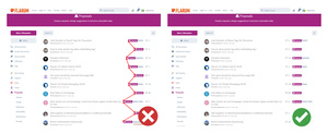
(Trick: Pure CSS) Tidy "Tags & Reply" counter on Flarum by Wellwisher
What you will achieve in 10 seconds or less:
Before/ After
Images used for demonstration purposes.

Tutorial
Step 1: Navigate to Admin Profile > Administration
Step 2: Then click on Appearance > Custom Styles > Click on "Edit Custom CSS"
Step 3: Paste the following CSS code, Done!:
/*Neatly Display "Tags & Reply" counter on Flarum by Wellwisher - START*/
@media (min-width: 768px) {
.IndexPage .DiscussionListItem-info > .item-tags,
.UserPage .DiscussionListItem-info > .item-tags {
left:78%!important;
max-width: 250px!important;
overflow: visible !important;
transition: max-width .2s ease-in-out,-webkit-mask-image .2s!important;
}
.DiscussionListItem-count {
margin: 12px 200px 0 0!important;
padding-left: 21px!important;
position: absolute!important;
left:71%!important;
}
.TagsLabel {
z-index: 2!important;
position: relative!important;
}
.IndexPage .DiscussionListItem-info>.item-tags, .UserPage .DiscussionListItem-info>.item-tags {
right:-100px!important;
-webkit-mask-image: linear-gradient(to right, #000 195px, rgba(0,0,0,0) 210px)!important;
}
}
/*Neatly Display "Tags & Reply" counter on Flarum by Wellwisher - END*/
What this CSS code aims to do:
This code refines the appearance and positioning of discussion tags and the reply counter in Flarum on larger screens such as desktop and tablets, ensuring they are aligned and displayed neatly, particularly on the right side of the discussion items.
The change relaxes the readers eyes. Normally people read left to right, and if information is neatly laid out and aligned well, content looks far more professional. Consumers consume because it's convenient.
Further notes:
- It's a bit of a quick botched job, the CSS needs optimising. 😃
- I have large tags so the widths are based of my site. Tailor to your tag sizes.
Back up:

*Images used for demonstration purposes.