- Edited

This will ultimately be a user controllable theme, just wanted to get some input on color scheme.
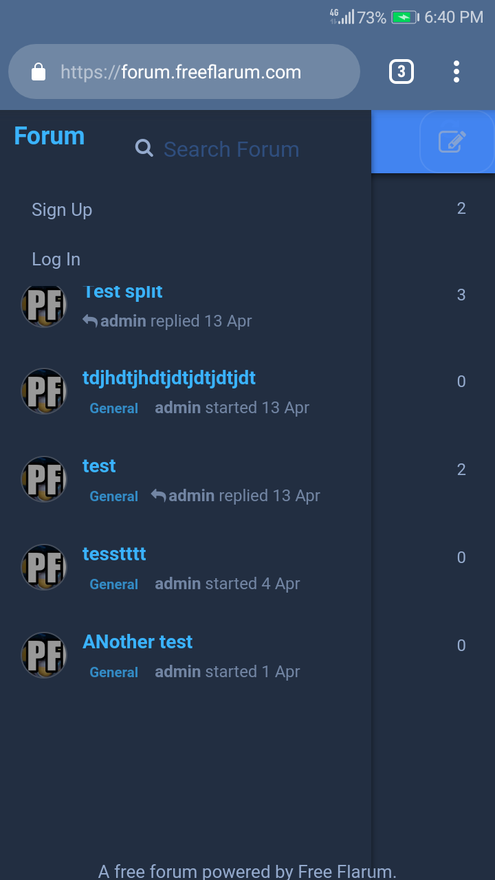
Forum home:

Forum post:

Admin area:

Demo:
https://forum.freeflarum.com
Paste into Custom CSS in Appearance options.
html {
*,
* *{
color:#94aacd !important;
background-color: transparent !important;
background-color: #222e41;
border-color:#485974 !important;
box-shadow: none;
}
&, #header {
color: #dee5e1 !important;
background-color:transparent !important;
background-color: #222e41 !important;
border-color:#485974 !important;
box-shadow: none !important;
}
.Composer-content {
background: #222e41 !important;
border-top: 2px solid #485974 !important;
}
.DiscussionPage-list {
background-color: #222e41 !important;
background: #222e41 !important;
border-top: 1px solid rgba(0, 0, 0, 0.2) !important;
border-radius: 6px;
}
.TagDiscussionModal .Modal-footer {
background: #222e44 !important;
}
.SelectTagList {
background: #222e44 !important;
}
.Button--user .Button--flat {
border: 1px solid #eee !important;
}
.UserCard{
background: #222e41 !important;
background-size:100% 100%;
}
.UserCard,.UserCard a{
color:#fff
}
.UserCard .Button--link,.UserCard .Search-input{
color:#fff
}
.UserCard .FormControl{
background: #222e41 !important;
background-color: #222e41 !important;
}
.UserCard--popover{
width:500px;
-webkit-box-shadow:0 2px 6px rgba(0,0,0,0.35) !important;
box-shadow:0 2px 6px rgba(0,0,0,0.35) !important;
background-color: #222e41 !important;
}
.UserCard--popover,.UserCard--popover .darkenBackground{
border-radius:4px
background: #222e41 !important;
background-color: #222e41 !important;
}
.UserCard--popover .container{
width:auto !important;
padding:20px !important;
background-color: #222e41 !important;
}
.UserCard--popover .UserCard-identity{
font-size:22px;
background-color: #222e41 !important;
}
.Badge {
background-color: #485974 !important;
}
fieldset button {
border: 1px solid rgba(255,255,255,0.1) !important;
opacity: .8;
}
fieldset button:hover {
border: 1px solid rgba(255,255,255,0.3) !important;
opacity: 1.3;
}
.Avatar {
border: 1px solid rgba(255,255,255,0.3) !important;
}
.AlertManager .Alert {
background-color: #222e44 !important;
border: 1px solid rgba(255,255,255,0.3) !important;
}
.Modal-content {
background-color: #222e44 !important;
}
.Modal-header {
background-color: #222e44 !important;
}
.Modal-body {
background-color: #222e44 !important;
}
h1,h2,h3,h1 *,h2 *,h3 *{
color:#3ab3fe !important;
font-weight: 700 !important;
background-color: transparent !important;
}
.App-nav .AdminNav .Dropdown-menu>li.active>a .Button-label, .App-nav .AdminNav .Dropdown-menu>li.active>a .Button-icon, nav, .navitems, .navi, .nav, .footer, footer, header, .header{
background: #222e41 !important;
}
img{
-webkit-filter:brightness(0.6) !important;
}
.Checkbox--switch .Checkbox-display {
box-shadow: 0 0 1px rgba(0, 0, 0, 0.1), inset 0 0 1px transparent !important;
background: linear-gradient(to left, transparent, rgba(62, 79, 103, 0.5), transparent) !important;
}
.on.Checkbox--switch .Checkbox-display {
background: #1b2028 !important;
}
.on.Checkbox--switch .Checkbox-display:before {
left: 25px
}
.Checkbox--switch .Checkbox-display:before {
content: ' ';
background: slategray !important;
border-radius: 11px;
box-shadow: 0 2px 4px rgba(0, 0, 0, 0.5) !important;
}
.DiscussionList-loadMore .Button {
background: rgba(255,255,255,0.3);
border-radius: 5px;
box-shadow: 0 0 1px rgba(0, 0, 0, 0.1), inset 0 0 1px transparent !important;
transition: all .5s ease;
}
.DiscussionList-loadMore .Button:hover:before {
width: 100%;
}
.DiscussionList-loadMore .Button:hover {
background: rgba(0,0,0,0);
color: #485974;
box-shadow: 0 0 10px rgba(255, 255, 255, 0.4), inset 0 0 5px #485974 !important;
border: 1px solid #485974 !important;
}
.DiscussionList-loadMore .Button:active {
background: rgba(0,0,0,0);
color: #485974;
box-shadow: 0 0 10px rgba(255, 255, 255, 0.4), inset 0 0 5px #485974 !important;
border: 1px solid #485974 !important;
}
.TagLabel.colored .TagLabel-text {
color: #3ab3fe !important;
opacity: .7;
}
.IndexPage-toolbar-view, .IndexPage-toolbar-action {
box-shadow: 0 0 10px rgba(46, 60, 84, 0.6), inset 0 0 1px transparent !important;
background: linear-gradient(to right, transparent, rgba(62, 79, 103, 0.1), transparent) !important;
}
.DiscussionPage-stream {
background: #222e41 !important;
}
.Dropdown-menu>li>a:hover {
text-decoration: underline;
box-shadow: 0 0 1px rgba(46, 60, 84, 0.1), inset 0 0 1px transparent !important;
background: linear-gradient(to right, transparent, rgba(62, 79, 103, 0.2), transparent) !important;
}
.Dropdown .Dropdown-menu>.active>a,.Dropdown .Dropdown-menu>.active>button,.Dropdown .Dropdown-menu>.active>a:hover,.Dropdown .Dropdown-menu>.active>button:hover .dropdown-menu>li>a:hover {
box-shadow: 0 0 1px rgba(46, 60, 84, 0.1), inset 0 0 1px transparent !important;
background: linear-gradient(to right, transparent, rgba(62, 79, 103, 0.2), transparent) !important;
}
.DiscussionListItem:hover {
box-shadow: 0 0 1px rgba(46, 60, 84, 0.2), inset 0 0 1px transparent !important;
background: linear-gradient(to right, transparent, rgba(62, 79, 103, 0.3), transparent) !important;
}
.sideNav .Dropdown--select .Dropdown-menu>li>a {
transition: background 0.5s cubic-bezier(.33,.66,.66,1) !important;
}
.sideNav .Dropdown--select .Dropdown-menu>li>a:hover {
box-shadow: 0 0 1px rgba(46, 60, 84, 0.1), inset 0 0 1px transparent !important;
background: linear-gradient(to right, transparent, rgba(62, 79, 103, 0.2), transparent) !important;
}
.DiscussionPage-list .DiscussionListItem.active {
border: 1px solid rgba(255, 255, 255, 0.1) !important;
border-radius: 2px;
-webkit-transition: border-color .15s, background .15s;
-o-transition: border-color .15s, background .15s;
transition: border-color .15s, background .15s;
-webkit-appearance: none;
}
.Post undefined .CommentPost {
background: #222e41 !important;
}
.Button--primary:hover:before {
-webkit-transform: skewX(-45deg) translateX(33em);
transform: skewX(-45deg) translateX(33em);
-webkit-transition: all 0.5s ease-in-out;
transition: all 0.5s ease-in-out;
}
.Button--primary {
border: 1px solid rgba(255,255,255,0.1) !important;
text-align: center;
text-decoration: none;
opacity: .8;
display: inline-block;
-webkit-transition: all 0.2s ease-in-out;
transition: all 0.2s ease-in-out;
position: relative;
overflow: hidden;
}
.Button--primary:before {
border: 1px solid rgba(255,255,255,0.1) !important;
content: "";
background-color: rgba(255, 255, 255, 0.5) !important;
height: 100%;
width: 3em;
display: block;
position: absolute;
top: 0;
left: -7em;
-webkit-transform: skewX(-45deg) translateX(0);
transform: skewX(-45deg) translateX(0);
-webkit-transition: none;
transition: none;
}
.Button--primary:hover {
opacity: 1;
color: white;
}
.SubscriptionMenu-button--false {
border: 1px solid rgba(255,255,255,0.1) !important;
text-align: center;
text-decoration: none;
}
.SubscriptionMenu-button--follow:hover:before {
-webkit-transform: skewX(-45deg) translateX(33em);
transform: skewX(-45deg) translateX(33em);
-webkit-transition: all 0.5s ease-in-out;
transition: all 0.5s ease-in-out;
}
.SubscriptionMenu-button--follow {
border: 1px solid rgba(255,255,255,0.1) !important;
text-align: center;
text-decoration: none;
opacity: .8;
display: inline-block;
-webkit-transition: all 0.2s ease-in-out;
transition: all 0.2s ease-in-out;
position: relative;
overflow: hidden;
}
.SubscriptionMenu-button--follow:before {
border: 1px solid rgba(255,255,255,0.1) !important;
content: "";
background-color: rgba(255, 255, 255, 0.5) !important;
height: 100%;
width: 3em;
display: block;
position: absolute;
top: 0;
left: -7em;
-webkit-transform: skewX(-45deg) translateX(0);
transform: skewX(-45deg) translateX(0);
-webkit-transition: none;
transition: none;
}
.SubscriptionMenu-button--follow:hover:before {
-webkit-transform: skewX(-45deg) translateX(33em);
transform: skewX(-45deg) translateX(33em);
-webkit-transition: all 0.5s ease-in-out;
transition: all 0.5s ease-in-out;
}
.SubscriptionMenu-button--follow:hover {
opacity: 1;
color: white;
}
.SettingsPage .Button {
box-shadow: 0 0 10px rgba(107, 131, 168, 0.4), inset 0 0 1px transparent !important;
background-image: linear-gradient(to right, transparent, rgba(62, 79, 103, 0.3), transparent) !important;
background-position: 0 4rem;
background-size: 1px 1px;
background-repeat: repeat-x;
font-size: 1em;
text-decoration: none;
transition: all 210ms ease-out;
}
.SettingsPage .Button:hover, .SettingsPage .Button:focus {
background-image: linear-gradient(to top, transparent, rgba(62, 79, 103, 0.3), transparent) !important;
background-position: 0 0;
background-size: 100% 100%;
border-radius: 5px;
color: #fefefe;
}
.SettingsPage .Button:active {
background-image: linear-gradient(to bottom, transparent, rgba(62, 79, 103, 0.3), transparent) !important;
box-shadow: 0 0 8px rgba(0, 0, 0, 0.2), inset 0 0 1px transparent !important;
border-radius: 5px;
}
.UserPage .UserCard-controls {
box-shadow: 0 0 3px rgba(107, 131, 168, 0.2), inset 0 0 1px transparent !important;
background-image: linear-gradient(to right, transparent, rgba(62, 79, 103, 0.2), transparent) !important;
border-radius: 5px;
}
.Dropdown-menu>.Scrubber {
border: 10px solid #222e41 !important;
}
.Scrubber-handle{
border-left: 1px groove rgba(255,255,255,0.1) !important;
}
.disabled .Scrubber-bar {
border: 10px solid #222e41 !important;
}
.Dropdown-menu {
border: 1px solid rgba(255,255,255,0.1) !important;
background: #222e41 !important;
background-color: #222e41 !important;
}
.sideNav .Dropdown--select .Dropdown-menu {
border: 1px solid #222e41 !important;
}
code, kbd, pre, samp {
color: #BDC6C1 !important;
background: rgba(0,0,0,0.52) !important;
}
.Post-body pre {
}
.Post-body code {
padding: 3px;
}
.PostMention, .UserMention {
background: rgba(66, 103, 153, .8);
color: white;
}
.tooltip * {
color: #eee !important;
background-color:rgba(0,0,0,0.9) !important;
}
}
@media (max-width: 767px) {
.App-drawer {
background-color: #222e41 !important;
}
}