CSS Adjustments


[deleted]
- Edited
010101 “Patches”
or Corrector 
- Edited

010101 @media (max-width: 767px) {
.ComposerBody-header li:nth-child(n+2):nth-child(-n+4) {
display: inline-block;
border-bottom: 0;
margin-right: -15px;
}
}
Simply awesome. This css fixed the tags selection issue on mobiles too. When we used to Choose Tags, the primary tags were going off the screen on mobiles on the top. You rock!!!  I will just use all your css.
- Edited
This css fixes the very narrow width with empty left and right space of the discussions on iPad Mini and some tablets. Only applies from 768px to 991px. All other resolutions the width is perfect. Sorry to post in your thread. Just thought may be it will be useful. Anyone please check and use it only if you like. Just sharing, not forcing it on anyone.
@media screen and (min-width: 768px) and (max-width: 991px) {

.container {

    width: 100%;

padding-right: 0px;

}

.DiscussionPage-stream {

    margin-right: 180px;

}

}

010101 Oh yeah wow, I didn't notice how abysmal the posting experience is on mobile once you throw on a few extensions.
Your CSS did improve the appearance on my site but it still didn't quite look right.
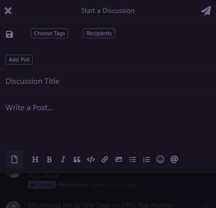
I decided to play with the CSS a bit more and managed to get those above button boxes to behave.
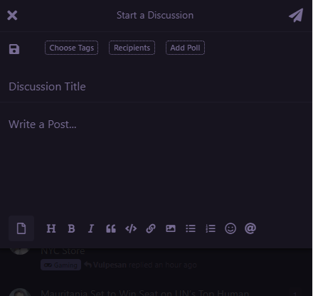
Here's the CSS:
@media (max-width: 767px) {
.DiscussionComposer-changeTags,
a.DiscussionComposer-changeRecipients {
margin-right: unset !important;
}
li.item-polls {
display: unset !important;
border-bottom: unset !important;
}
}
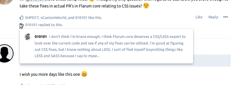
.Post-mentionedBy-preview,
.PostMention-preview {
width: 600px;
max-width: 90vw;
}Before:
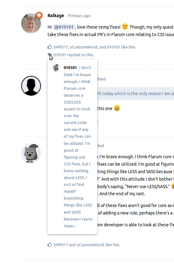
After:
[deleted]
rob006 Nice - thanks
- Edited
SqueakyBlum Cool. This one is also one of the hardest items to patch. The reason is, it could also depend on the extension itself. In other words, someone could create an extension tomorrow that adds another button to the top of the post box and they could also add CSS which breaks these patches. Your solution didn't work for me, but I'm also not using the drafts extension and I see you are. That alone could make the difference.
Core needs some magical CSS or other code added to force these types of extensions to stick with a certain layout. But, then again, it's the nature of the beast. Using WordPress as an example, you could easily install a plugin which messes with your site's styling... so, it is what it is. Each webmaster has to do what works for them the best.
[deleted]
010101 It does exactly the same thing here...
nitaaikumar I tested this and it works for me as well so I will add this to my original post. But, I'm curious just for my own peace of mind, why did you choose 991 for the max width and 768 for the min width? In core code I think Flarum sticks with 767 for the min width (which is a 1px difference). And then I'm just not sure how official the 991px for the max-width is? Obviously it works, things look fine... but I'm still curious if those are the best pixel choices... I have no idea.
Anyone else? What pixels should we stick with for min and max widths for @media styles?
@media screen and (min-width: 768px) and (max-width: 991px) {

.container {

    width: 100%;

padding-right: 0px;

}

.DiscussionPage-stream {

    margin-right: 180px;

}

}

- Edited
010101 The text column width becomes very narrow only from 768px to 991px, not from 767px or for 992px and more. So I just used the exact values to target that issue.
010101 There would be a way to use wildcards here if the extensions had more consistent css syntax.
- Edited
Does anyone know yet if any of the above CSS tweaks (minus the user directory one since that's not core) were addressed in the beta 11 release? I'm trying to gauge whether or not the original post of this thread needs to be updated.
It does seem like the composer post box going off screen on mobile might have been fixed. At least for me in a new installation, that particular CSS tweak doesn't seem to be necessary anymore.

010101 You can see the full diff between the two version on Github here.
- Edited
jordanjay29 Thanks, but I personally can't tell from that if any of the above CSS is still needed or not. I think maybe one of the rules isn’t needed anymore - the full width rule. Maybe it was never truly needed. I edited the original post; added a comment about that rule.
The rest are most likely still needed as of beta 11, unless someone can prove otherwise.
FYI, I added two rules to the original post. One fixes an odd menu text disappearing issue, and the other is a personal preference; centering post images on mobile.