v1.2.0
Thanks Microsoft first, we improved UI details by researching Microsoft's open-sourced Windows UI Library code.
TL;DR
Progress Ring no longer looks jagged.
Apply new acrylic material for some controls.
Changed some details.
Full Changes
- Updated margin of context menu.
- Updated border of buttons and removed shadows.
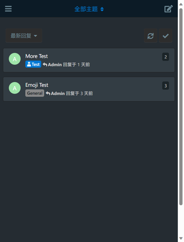
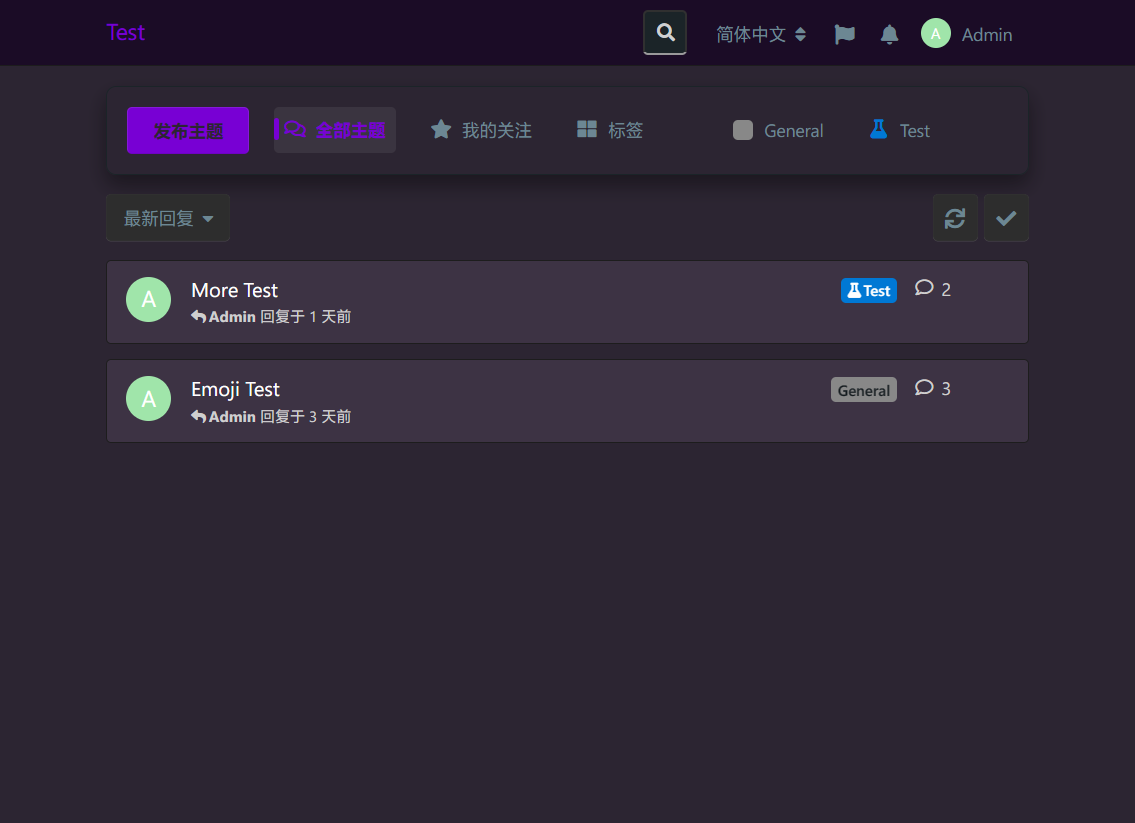
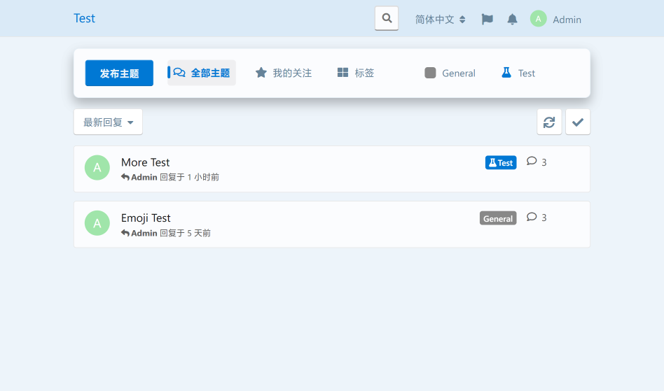
- Updated borders of UI, now they're translucent.
- There's no gap between round corner of modal window and border anymore.
- Applied accent color for a few of controls.
- Updated background material to translucent.
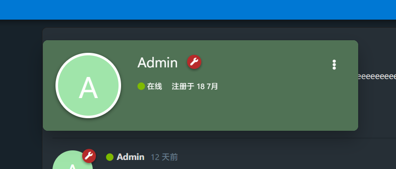
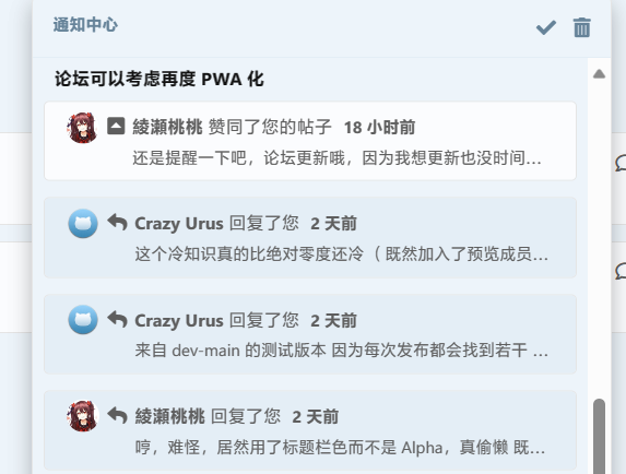
- Updated appearance of notification UI.
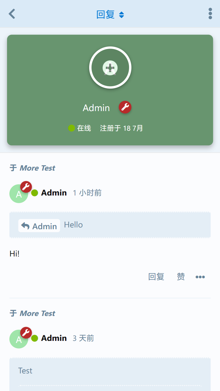
- Updated background of modal window.
- Updated style of input controls and select controls.
- Updated style of tooltips and applied acrylic.
- Fixed the problem of low contrast button on the frame displayed around flagged posts.
- Applied new acrylic material for context menus.
Note
Acrylic only available when:
- Current Flarum layout isn't in mobile mode;
- Your browser supports
backdrop-filter CSS (Not include -webkit-backdrop-filter);
If your device doesn't meet requirements, the controls that applied acrylic material will back to pure color background.
This version of theme uses outline partly replaced border, and it'll affect some controls displaying wrong what has .Dropdown-menu class and aren't context menus.
- For user: Tell us to fix problem for these UI.
- For developer: Please avoid using
.Dropdown-menu class for UI that isn't context menu.