
and

and
I really like your mod!
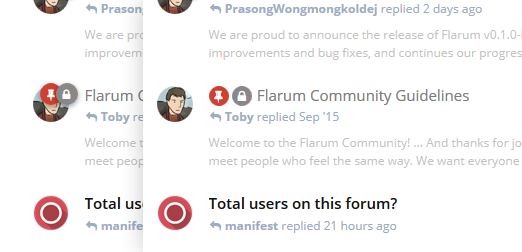
Online status is also on the same section. If you put all those icons there, would it be too crowded?
Digital One could move the online status to the avatar.
Kakifrucht I think Digital is referencing the fact that online status is already on the
avatar. EDIT: Nope, it isn't. LOL, my bad.
But I kind of like this idea.
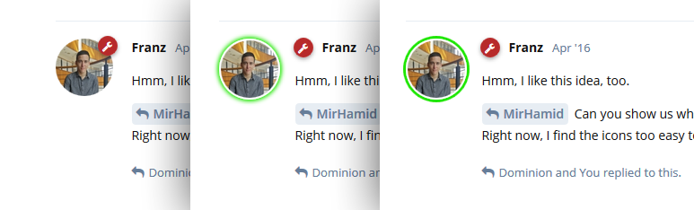
The idea is good. Instead moving online status dot on avatar, it would be more appealing to have green circle around the avatar to show the user is online.
I really think that it makes both more sense and looks more appealing to inline the icons with the discussion title in the discussion list, to clearly seperate the actual discussion icons from the user, as putting the icons above the avatar could be confusing (they don't belong to the user, but to the thread).
I'm not sure if I like the group icon better inlined with the username or on the avatar, as it might look weird when having multiple groups (I like the way they kinda stack/overlay right now). If this would be changed it should be configurable.
I'm only halfway there. I really like this idea ...
... because it's common to see more than one badge on a discussion, and they tend to cover up the smaller avatars used in the index. I don't see a point in showing an avatar if it will be mostly obscured by badges. And semantically speaking, the badges belong to the discussion (represented by the title) not the user (represented by the avatar), as Kakifrucht pointed out already.
EDIT: My only concern is how we'd handled "Followed" posts. The little pushpin and lock icons are fine, but I suspect that a small yellow star isn't going to cut it. Perhaps that one should be in a yellow circle, as Franz suggested.
On the other hand, I don't really see a need for this ...
... because the avatar is larger to begin with, and it makes more sense to put the group badge on the avatar. I'm also worried that the smaller group icon next to the name will be less noticeable, as Franz indicated.
So I'd vote yes (with the "Followed" caveat) and no, respectively.
Dominion On the other hand, I don't really see a need for this ...
... because the avatar is larger to begin with, and it makes more sense to put the group badge on the avatar. I'm also worried that the smaller group icon next to the name will be less noticeable, as Franz indicated.
So I'd vote yes and no, respectively.
Try it when the user has multiple badges. Same problem as what you see on the Discussion List page.
jordanjay29 Same problem as what you see on the Discussion List page.
It wouldn't be quite as bad, as the avatars are bigger. But I'll concede that multiple badges could pose a problem.
Still, while I think the little pushpin and lock icons are fine as they are, the little wrench next to luceos' name doesn't shout "Hey, this guy's an admin!" the way the avatar badge does. It needs a bit more oomph.
Dominion Still, while I think the little pushpin and lock icons are fine as they are, the little wrench next to luceos' name doesn't say "Hey, this guy's an admin!" the way the avatar badge does. It needs a bit more oomph.
I'm fine with this. Put the whole badge, not just the FA icon, on the username line then? The circle background should make it pop enough.
EDIT: FYI, I don't actually think the avatar is big enough. Here's what it starts to look like:

jordanjay29 Here's what it starts to look like:
I see what you mean, but that doesn't bother me quite as much as the ones on the index (which tend to cover the eyes on the avatar, if a portrait photo is used). Even after Toby made the index badges smaller, the fact that they cover the upper part of the face has continued to bug me a little.
I wonder if it wouldn't be possible to show just the single "most important" group badge on the avatar, and display the full collection of badges on the profile popup? An arrangement like that would also be useful to an extension that adds badges for achievements or other gamification schemes.
(I'm not sure how Flarum would decide which group badge is the most important, though.)
Dominion (I'm not sure how Flarum would decide which group bade is the most important, though.)
Perhaps differentiate between those with mod / admin powers and those that don't? Also perhaps relevant badges. Eg displaying a Docu badge for a discussion requiring a Docu badge to view / reply to a thread
Kulga Yeah, I don't know that you could algorithmically determine a hierarchy that's going to be accurate each time. At best you're really just guessing. If a site needs/wants to have all those badges displayed, they're probably not going to enjoy the trimming feature. If such a thing existed, I think it'd be better as a manual control on the admin (display badge per group) or user (choose which badges to show) side.
Maybe we need to see a mockup of different ways to display the badge not on the avatar, though. Different avatars are going to look different with the badges, and someone with an element to the top-right is going to get screwed either way. Or the badges are going to cover up an element so as to make the avatar look inappropriate for the community. I think the badges on avatars is a nice idea, but it might cause more problems than they're worth.
The current system does feels limited in how many you could apply - if only aesthetically.

Kulga Maybe they should start circling the avatar. The Ring of Group Badges. ?
Even two or three badges are going to start covering significant parts of the avatar. Having some kind of display solution, be it moving the badges, or choosing which ones to show, is probably a good idea. I can probably put together a mockup tomorrow if MirHamid doesn't beat me to it.